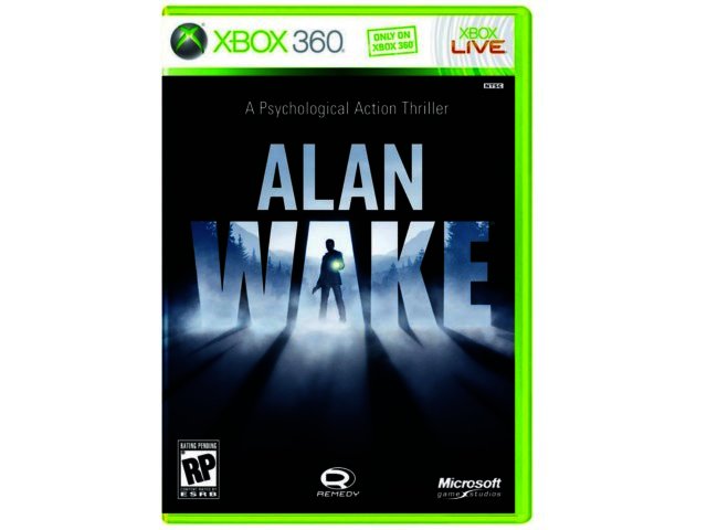
The reason i feel it is a good design is because it encompasses so much of the game in a simple way.
The art gives you Alan, who is the main character. It also gives you the game's weapons, a flashlight, and a gun. The concepts of light and darkness are also represented on the cover; they are important parts of the game. Last but not least you have the setting, subtly inserted in the word WAKE, that being a small town in the countryside, with plenty of woods and hills.
I felt this cover represented exactly what the game was about, and it needed to be shared.
That's it for now, thanks for reading.
Thank you for sharing a successful cover. I see what you mean about the concept of light and dark, especially because there is a lot of fog present but it looks like it is actually daytime. Simple, yet effective. It showcases the main character, the concept of the game, and all the weapons used at the same time. Nice!
ReplyDelete