About Me

My photo
Want to know about me? Well let's see, i am a giant geek, i love books, comics, movies, music, video games. It's easy to tell my interests by my t-shirt. Feel free to hit me up on Facebook at /felipefireboy or on Twitter @immortalfireboy or email me at fireboy.oliveros@ttu.edu

Monday, May 2, 2011

Memo - Culture

In an increasingly digital word, technology changes faster than most people can adapt. Every few months the best and newest electronics come and people rush out to buy them. To keep up with these changes, all other aspects of our life must try and keep up, including design.
The ability of design to change according to the culture it must appeal too is incredibly interesting. The current generation is very tech savvy, and a lot have internet access 24/7. In order to appeal to this audience, designers must look at the culture as a whole. Who are they? What do they do? What do they like? How long can I keep their attention? Designs trying to appeal to the younger crowds will most like will be very sleek, very clean. For proof of this you don’t need to go further than looking at advertisements for smart phones. Most of these will have the device, at an angle, set in front of a solid background. By keeping the advertisement uncluttered, they allow their device to be the center of attention. This allows it to capture the focus of the audience easily, by drawing their eye directly where they want it to go.
Design styles must also change in order to keep up with the technology. The designs must be able to work on all sorts of mobile devices. Laptops, netbooks, tablets, smartphones. How small do I have to make this? Do I need to re-arrange the page to fit better on a smaller screen? In addition to the hardware, things like HTML5 also influence design. Any new change in our interaction must be followed by changes in designs to help compensate.
I really enjoyed learning about culture in design because after reading about it, it became something that I could then see in my everyday life; once it was seen, it could not be unseen! It changed how I looked at advertisements, book covers, websites, and packaging. It also amazed me how much of this design based on culture was being used in conjunction with social media. Every page had buttons to link it to another communication like Facebook, Twitter, Email, Tumblr.
In our growingly connected culture, knowing how to design based on the interests of your audience is going to become an increasingly important factor.

Thursday, April 21, 2011

Book Cover

Hey it's my fifth and final re-design! I had been holding out on this one so i could take my time and really put lots of though into it.
We have all seen the original design of this book. Most of the class agreed it was quite odd for a design book to be designed so badly. For my assignment i decided to challenge myself to come up with a better design.
As i was doing this i decided i wanted to keep some of the original book's layout. I wanted to keep the placement of the title and author's name in similar places, and also keep the horizontal band across the middle part of the book.

The most striking design aspect i used was contrast. I chose to go with a black and white contrast because it is simple, and elegant. I wanted the design to be able to stand out, but also to work well with both the QR tag and the UPC code.  The colors of the book will pop, and draw the attention of the readers.

Something fun i did with the re-design was in the title. I used the different styles of fonts listed in the book, and applied them to the word "design" in the title. I felt that it would reinforce the idea that this was a design book,  but also be a fun playful aspect to the book.

The biggest thing i wanted to do with this redesign was to reinforce the idea of culture in design. In order to do this, i had to think about what design meant to people in our generation. The first thing that came to mind was of course Photoshop! Graphic design is a very popular activity among people in my generation, and the most prominent tool in their arsenal is Photoshop. To reinforce the aspect of culture the most important thing to do was to create a book that looked like a work in progress. In order to do so i included the grid-lines, which are a very prominent part of design. I made sure that the canvas and lines were a nice enough proportion to each other. While i di not use them exactly to align everything on the cover, i made sure that the did not look intrusive or distracting to the design. I also felt like i should include the mouse pointer, as it makes it feel like they are looking right at a computer. Originally i planned to go even further and add more Photoshop elements into the design, but felt that their addition would be too distracting, and would not properly convey the right message.

Finally, i once again included a QR tag into my design. These tags are the wave of the future. They allow you to quickly aggregate information with the click of a button. The one on this cover goes to the book's Amazon page.

My final re-design, and very cool book cover.

Thursday, March 31, 2011

Business Card 2.0

Front

For my next re-design, i decided to create a "business" card for myself. I use the business term lightly because it's more of a social thing, and less of a formal one. Being a giant geek and gamer, i like to go to comic conventions, and also make connections with fellow gamers wherever i can find them. In addition to that, i am also a huge fan of social media, experimenting with many of the available ones. I felt that i could create a "contact card" that would let people connect with me easily, and it would be something i could easily share with people. I call it 2.0 because instead of a traditional card, this one has my gaming tags, and social media addresses, and also a QR tag on the back. Since the way we connect is evolving, i felt it was only fair the business card did too.

Back
I tried to really implement rhetoric into this design. What i mean by that is that i really tried to persuade the audience to find and contact me online. How so? well by providing 5 different ways to find me. I included 2 gamertags, 2 social media websites, and my email. By giving them so many ways to reach me, i am basically saying "HEY DO THIS". In addition to the 5 ways, i also include "Find me online" to just outright state what they should do. The rhetoric is strong because there is only one propose fr the card, and i make it very clear.

I think the most important part of this design is culture.Culture plays a big part in most designs now because of our rapidly evolving internet presence. As you can see, none of the traditional ways of contact are on the card. I have no address or phone number, since those are the old ways of communicating. I include only the most popular current ways of communication, email, Facebook, and Twitter. As part of the 2.0 you can see i included a QR (quick response) tag on the back of the card. By snapping a picture of this code, you easily get all of the same information provided on the card. By including this, i give the recipient the option to simply discard my card and leave all the information stored on their phone or mobile device. Culture also played a part in changing the orientation, since i felt it should be horizontal unlike traditional cards.

Now for the more design-y parts of my card, i chose red and black for the colors because they are my favorite, and this card should represent me. These colors also create a great contrast, which is always a plus. For the font, i had to use two different ones. My main font was a sans serif font, that was all uppercase, as i felt it looked more futuristic and modern. I had to change the font for providing my information, because some of it is case sensitive. I had to keep a similar theme so i chose a font that was similar, but had lowercase letters. And finally, to add my personal touch, i included a flame symbol, and a motto that i use to represent me.

EDIT: Craaap. My pictures came out tiny for some reason. I made sure to make my canvas the same size as a business card but somehow it shrunk incredibly.

Sunday, March 27, 2011

Graphics

Visual culture is a very important factor when deciding on what graphics to use. One such example would be the book cover i plan to design. We use two books in this class, and neither have very exciting cover art. The reason i feel culture is important is that these books should be designed to appeal to current college students. Our generation has a growing trend of more and more people using photo editing programs and becoming interested in design. In order to appeal to the culture, i plan t create a cover that looks like a work in progress. One of the corners of the design will be peeled away to reveal the grid-lines underneath, there will be dashed boxes around some parts, there will me measurements and icons. By doing this, it will be easier for the readers to feel connected with the book because it will seem like something that the could do themselves. Another idea is to present the cover as it would look in the program itself, with toolbars and such. By doing so, i can create a very cultured cover, one that appeal to the masses interested in design.

Sunday, March 6, 2011

Texas Tech Typography

Quite a title. Texas Tech University has and incredibly detailed and thorough  set of rules and guidelines which help to create a solid sense of community. Texas Tech uses only 2 kinds of texts, a Serif by the name of Charter, and a Sans serif called Helvettica Nue. Charter is used for any headings and material with lots of university information, while helvettica is used for subheadings and body text. I think the use of serif and sans creates an amazing contrast. By using red headings with charter text, with black helvetica font for the body, the contrast created becomes instilled in the reader's memory, since the same style is seen repeatedly in various materials. While i think that the use of the oldstyle serif to pay homage to the traditional ways of an old university, i think it could be replaced with a modern font style as a way of showing progress, a way of updating the university's style.


I for one love the Tech Identity Guidelines, i feel that they have been thoroughly thought out and researched, and they are very strong, and present a great style for the university.

Thursday, March 3, 2011

Resume - Gaming Industry?


For my third redesign I decided to do my resume. After seeing those very interesting examples from the internet, I felt I should try and create a resume that was different. Instead of staying with the traditional black and white boring formal resume, I tried making it more uniqe. This task turned out to be harder than I though, as the Technical Communication doesn’t really lend itself to uniqe design as a Photography or Art Design based one would. I thought I would try anyway, and I tried to use gaming as a sort of goal for the resume. What I mean by this is that I tried to create a resume that was inspired by video games. While it didn’t work out exactly as planned, it managed to retain a fe aspects from my idea.

The first and foremost principle I covered in my re-design was contrast. Because most resumes are usually black and white, I decided to keep the colors, but reverse their use. I made the background black, and used white text. I used grey as a compromise between both, because it would allow for the contrast between the two to be softened.  The gray was light enough to offset the black, but dark enough to have a great contrast with the white text.

The second principle I applied was alignment. I decided to base the placement of objects in a layout I had seen in a magazine. It had 2 pictures, with a bigger picture under it, and another two of the small pictures.  You can see this in my design as I have the objective in a wide box, while the objects below it are half as wide and fit perfectly under it. I also made sure that the document had a evenly spaced border around it. I also spaced the objects on the space evenly from each other. These elements combined allowed for a great alignment.

Using what I learned about type from both books, I decided to pick a sans serif font. In keeping with my game related theme, I decided to pick a font called Futura. The sans serif font was great in my game related resume because it feels kind of futuristic. Because many of the video games I play are based either in the future or in science fiction, any font besides a sans serif would have looked bad. Futura worked great because it consisted of perfectly straight lines, and reminded me of the Helvetica style “plain” fonts I find in games like that.

Something that I did in my re design but don’t have a category for is the use of a 3d effect. The four bottom objects had the 3d effect applied to them. The effect took the outer edge and used it to lift them upward, toward the center of the page. This effect makes the objects look wrongly shapen at first glance, but upon the closer inspection, it looks like the objects are held in the 3d space eminating from the page.

Sunday, February 27, 2011

The Gutenberg Press

The Gutenberg press is one of the most significant creations in history. The reason for this is the fact that it greatly increased the speed at which information could be spread. The first big project completed by the press was the Gutenberg bible. The creation of this book allowed for religion to be spread at an incredbly accelerated rate. Because of the increased ease for creating printed materials, information was now something that could be easily shared by the masses, no longer a need to handwrite letters and have meetings. People could now be informed with leaflets or pamphlets. The press also allowed for the first newspapers to be created, allowing the spread of information in a cheap and easy manner.


It's hard to imagine a world without this invention. The creation of the press would eventually lead to the typewriter, which would make "home printing" a possibility. Eventually this would lead to home computers. The ability to press a button that produced a letter is one of the most important of our time. Now we can possibly write novels on our phones with 4 inch screens. Without the press, the mass production and distribution of books would have never become a possibility.


Gutenberg's name is still kept alive to this day by Project Gutenberg. http://www.gutenberg.org/wiki/Main_Page
 By using his name, this group is able to continue to honor his legacy even as we slowly move away from traditional print formats.


"The mission of Project Gutenberg is simple:
To encourage the creation and distribution of eBooks.
This mission is, as much as possible, to encourage all those who are interested in making eBooks and helping to give them away."
The goal of the group is to create a place where free ebooks can easily be distributed, allowing for them to be shared by the masses.


Many thanks are owed to Gutenberg, because without his breakthrough in technology, i would not be able to be typing this.

Sunday, February 13, 2011

Page Design

Page design is the process of placing design objects such as text, headings, and images consistently and effectively on the page, taking into account the actual visual field, the characteristics of the design objects, and the 
relationships implied among them by the principles of design. (pg 115)

In simple words, page design is the process of using your familiarity with the concepts we have previously learned, and applying them to a “page.” The page is the document you are creating, the part that can be seen in whole by the reader at one given point. A brochure would have multiple pages, because there are pages on top of pages, while a 
book cover would be a singular page.

For my design, the most important principle i took from the book was that of the Power Zones. According to the book, the power zone is the top left corner of the page. From there the zone extends horizontally along the top, and vertically down the left side. For the round sign, i was originally going to put the text at the top and bottom, but upon remembering the book, i decided to shift the text counterclockwise, placing it into the the corner, which is the strongest part of a page. This was also surprisingly important in my rectangular sign, where I instinctively placed the image at the left side, as i tend to always do, until i remembered the power zone principle. That's when i realized that i should place the image on the right, and placed the text on the left side, because that is what i need the eyes to focus on. 

Thursday, February 10, 2011

Bangkok Thai Restaurant Signs

Last week I was driving down 34th and came across a sign that said Bangkok Thai Restaurant. It was black text on a white sign, and there were actually two of them, a round one on the building, and a rectangular on facing the street.  I felt like that a restaurant should have better signs so I decided to make them. As you can see I made both of the signs, one round, and one rectangular. Because the rectangular one faces the street, I felt like it should include the address and the phone number.

The first thing to be noticed on the design is the contrast of colors. I actually received some help from the internet in choosing the colors I would use. Someone on the internet decided to create a color palette for thai food, so I chose Pad Thai, the most well known that dish, and used the colors that were in that dish. http://www.colourlovers.com/blog/2007/11/12/colors-of-global-cuisine-thailand/ I chose to use three of the colors, described here simply as a light brown, an orange, and a green.  I felt that these colors contrasted well because not only did they feel like warm colors, but they did a great job representing the food itself. The background originally started off as a solid color, but it just lessened the impact of the other colors in the logo, so I decided to add an effect that broke it up and added small amounts of white to the whole thing.

The second important concept was alignment. Because the round logo goes on the actual building, I felt that it should be very simple and just include an image and the name of the restaurant. For the round logo I placed the image of Thailand in the dead center, but aligned the text in a unique way. Using the idea of power zones, combined with traditional American reading order, I decided to place the objects in a diagonal line, heading from northwest to southeast. “Bangkok” was placed in a corner, because it is the strongest power zone, since reader’s eyes always start there. The eyes would then go to the image in the center, and continue to the bottom right corner to “Thai Restaurant” I also decided to curve the text along with the logo, as it would create a stronger visual connection.

For the rectangular logo, I decided to include more information, so I added the address and the phone number.  Since this sign faces the street, I felt that it should be more like a business card, and used some of those ideas. I decided not to place the image on the left side, since it would be in the power zone and therefore detract attention from the text. I therefore placed it on the right side, and decided to center the text in the empty space. Because I did not feel that the image of Thailand created a hard edge, I felt that aligning the text right would now work very well, as the white space would be uneven.

I was very happy with the pair of logos I managed to create, and await plenty of feedback.


Sunday, February 6, 2011

Three Significant Concepts

Concept 1 - The four basic principles (pg 13)
-These four principles are probably the most important concept to take away from this class and texts. The four principles are the "building blocks" for everything we will do in this course. While they are more ideas, than rules, it is very advisable to follow these four. There two others covered in the Kimball/Williams book, but they are not as important as these four. Any design should be created with these principles in mind, because they are what make the reader focus on the object. "If you design it well, they will look at it"

Concept 2 - Design Objects and their Characteristics (pg 21)
-The ideas presented in this section add to the tools that the previous concept contained. While the concept 1 contained what could be best understood as conceptual ideas, concept 2 contains more actual rules , dealing with size, color, text, and other aspects of design.

Concept 3 -  Formats in Print and Screen (pg 85)
- This concept is important because it shows the many diverse ways that we can present information. Paper can be molded/shaped into many different formats, and each format must be designed differently. Screen formats are alot different, because there are both more, and less ways to share the information. By that i mean that most screens are rectangular, but they also come in many sizes, from a tiny phone screen, to a big computer screen.

While i only picked these 3 as the most important to me, there are a bunch more interesting concepts in the book that affect the way we design things.

Thursday, January 27, 2011

Texas Tech ID

Sorry about the pixelation of the text, did most of the work in Fireworks,
then tried to do final tweaks in Paint.net,
which resulted in pixelation, will be fixed when i revise it.

Well ladies and gentlemen, here is my first attempt at redesigning the Tech ID. I say first attempt because I will sure be re—doing this again before the final, because by then I hope to have improved my image editing skills.

On to the main event! Here we have a attempt at fixing the current Tech ID. I have mentioned the problems with it in a previous post, but will go over it here.

Contrast – The first thing I noticed while looking at the ID, was the fact that it had two different fonts, one for Texas Tech, and the other for the three other lines of text. To fix that, I reproduced it all in Times New Roman, since I could not get the original font. I also used the same colors on the whole card, since they create a natural contrast that attracts a reader’s attention to it.

Repetition – Colors! This was the easiest thing to do, since Texas Tech uses a great combination, black, red, and white. It was incredibly easy to create this repetition because all the logos, texts, and background use the three colors, creating an incredible unity on the product.  Initially I had just a red background, but my roommate suggested I keep the wave in the id, but change the colors to black and red. This allowed for an increased repetition, to go with the logos included in the id.

Alignment – In a previous post, I explained the alignment problems.  There are three things that were aligned well, Texas Tech, the picture, and the double T. These are all set in their respective corners, correctly spaced (for the most part). The four other elements on the card however, were very misaligned. This was the masked rider logo, and the three lines of text.  In the new card, everything is aligned, with a visual connection with something else on the page. The picture and all the text is right aligned along the same strong edge, making it look clean. I decided to cut the double T in half, because it is symmetrical and so easily recognized,  and I felt that it would still be the same without taking up all the space. The crest is perfectly centered, and has the same distance from both the edge of double T and the edge of the picture.

Proximity – This was a big problem in the original design, there were three different lines of text, all placed in different places on the card. The name and student were not placed close enough together to act as a unit, and the R number was off by itself, centered at the bottom of the card. In the redesign I placed them all together, stacked, to allow them to work together as one cluster of information. All the data the card has to offer is now in a single location, easing its use.

Any constructive criticism will be greatly appreciated and acknowledged, because I am already planning what changes I could make to further improve it when I gain better skills at photo editing.

Tuesday, January 25, 2011

The Texas Tech ID

Contrast - The id does not follow the principle of contrast, because it has different fonts, and different kinds of bolding on the font.

Repetition - The ID does okay with the principle of repetition. It uses the same 3 colors on the card, it uses graphics that are well known in the Tech community, the masked rider, the Double T, and the Texas Tech quote. The use of different fonts and boldness however, ruins the repetition by having too many variables.

Alignment - Alignment on this card is a mess. The Quote is aligned left of the whole id. The masked rider is aligned center, but only in the area of about left 66 percent of the card, and not the card as a whole. The R number is then centered in the middle of the card, and is the only thing aligned like that. The picture is aligned right, but the label "student" is misaligned under it. The name is also aligned in its own way, with no relation to anything else on the card. The Double T is then just aligned right at the bottom corner of the page.

Proximity - Another problem in the card is the proximity of the items on it. "Student", name, and r number are all placed in different locations on the id, resulting in the lack of cohesion of the information presented on the id.

Monday, January 24, 2011

Alan Wake

So i recently finished this game, and i though I would share the cover art because i feel it is very well done. I talked about The Orange Box and it's bad art before, so i though i should share a example of good art.

The reason i feel it is a good design is because it encompasses so much of the game in a simple way.
The art gives you Alan, who is the main character. It also gives you the game's weapons, a flashlight, and a gun. The concepts of light and darkness are also represented on the cover; they are important parts of the game. Last but not least you have the setting, subtly inserted in the word WAKE, that being a small town in the countryside, with plenty of woods and hills.

I felt this cover represented exactly what the game was about, and it needed to be shared.

That's it for now, thanks for reading.

Sunday, January 23, 2011

The Artifacts

Artifact 1 - The Texas Tech I.D. Card.
Please ignore my terrible picture.
The tech ID is changed every couple of years, so i thought i'd throw my own hat into the race. While i no longer remember how the last ID looked, i think i liked it more than this one. I chose this instead of a business card because i expected many people to do that one and i wanted to change things up. If i get enough positive feedback i might try sending it to Tech as a submission for a possible future design.


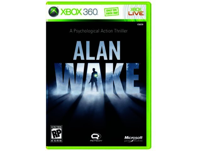
Artifact 2 - The Orange Box
When this was released, it was met with universal acclaim, 5 games for $60, what could be better? The fact that they were all great! So while the collection received praise, the only reoccurring negative comment was that the box-art was not very appealing. I decided i would redesign it, and maybe print it out to use for myself! :D


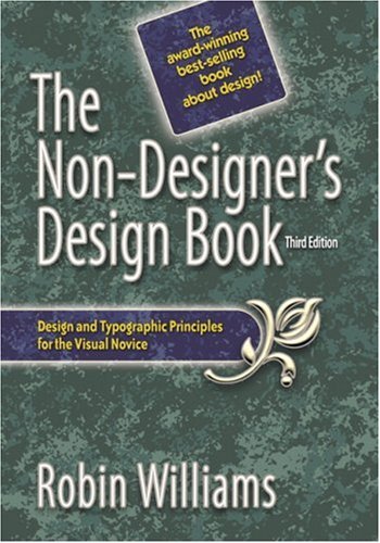
Artifact 3 - The Non-Designer's Design Book
I was surprised when i got this book. For a design book, it has a pretty unappealing cover. This was the first artifact i picked because i was sure i could make a better cover. I hope i am up to the challenge!


Artifact 4 - Resume
I chose the resume as an artifact because i feel that all the ones i have ever done have been bland. I did not digitize my most current one because i can't find the file. But i think this will be one of the hardest to do, because there are millions of resumes out there, and i have to figure out how to make mine stand out.


Artifact 5 - The Ihop Logo.
It's simple, but is it too simple? Sometimes simplistic designs can be good, like the apple logo, but others, like this one, just seem uninspired.


For these assignments, we are using Williams's four basic principles of design

Contrast - Similar, but not the same. Make the objects different enough to where they attract attention.
Repetition - Try to repeat design elements in your works, colors, shapes, fonts. Unites the elements on the page.
Alignment - Know where to put your elements. Know why you're putting them there, make sure nothing is randomly placed.
Proximity - Create clusters in your work. Similar items should be grouped close to each other so they act as one singular object.

Thursday, January 20, 2011

Tuesday, January 18, 2011

Assignment Ideas

Drats! This is my first blog post, and it is late, need to get back into the routine of checking my school email. But here we go! Allonsy!!!
Hello there new acquaintances! My name is Felipe Oliveros, and I am you new classmate. I am majoring in Technical Communication, and minoring in Spanish. 

In our first class we discussed many possible ideas for the assignments this semester. Some of the ideas are general assignments that would be very productive for anyone; these are the Resume and Business Cards. I feel these should be done first, just so that everyone can start off on the same foot, without any advanced design techniques being introduced until everyone has built their foundation. The resume and business card are good assignments for anyone and everyone, because they will help in the forthcoming job market search.

The second tier of assignments would be the flyers, brochures, and logo design. In this set of assignments we would move into more creative aspects of information design. These however, are still very relevant to many of the fields of study or work related to the students in the class. Anyone hoping to work with companies, of many kinds, would greatly benefit from learning how to design these things. I feel these would help me, as I will likely be doing this myself.
The third tier would be more design specific assignments. Although these will not apply for everyone’s futures, they would be greatly beneficial for everyone. These assignments would be advertisements, menus, packaging, and book covers. These would come later in the semester, once everyone has gotten the hang of the basics, and would let everyone let their creativity flourish. While these will not be related to everyone’s career after college, they will be good things to have in the creative arsenal.

I am very excited to see what this semester has to offer, and look forward to working with all of you.