Artifact 1 - The Texas Tech I.D. Card.
 |
| Please ignore my terrible picture. |

When this was released, it was met with universal acclaim, 5 games for $60, what could be better? The fact that they were all great! So while the collection received praise, the only reoccurring negative comment was that the box-art was not very appealing. I decided i would redesign it, and maybe print it out to use for myself! :D
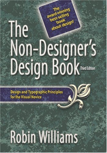
I was surprised when i got this book. For a design book, it has a pretty unappealing cover. This was the first artifact i picked because i was sure i could make a better cover. I hope i am up to the challenge!
Artifact 4 - Resume
I chose the resume as an artifact because i feel that all the ones i have ever done have been bland. I did not digitize my most current one because i can't find the file. But i think this will be one of the hardest to do, because there are millions of resumes out there, and i have to figure out how to make mine stand out.

Artifact 5 - The Ihop Logo.
It's simple, but is it too simple? Sometimes simplistic designs can be good, like the apple logo, but others, like this one, just seem uninspired.
For these assignments, we are using Williams's four basic principles of design
Contrast - Similar, but not the same. Make the objects different enough to where they attract attention.
Repetition - Try to repeat design elements in your works, colors, shapes, fonts. Unites the elements on the page.
Alignment - Know where to put your elements. Know why you're putting them there, make sure nothing is randomly placed.
Proximity - Create clusters in your work. Similar items should be grouped close to each other so they act as one singular object.
Those are some very good ideas! I especially like the idea to redesign the Tech IDs. The IHOP logo is pretty plain like you said, and I'm looking forward to your changes.
ReplyDeleteI thought I might be the only person who thought that the design for the 'design' book was extremly ugly! Good to know others agree, and I'm curious to see your redesign. Thank you for restating the design rules we need to follow for the assignments. It's a good refresher!
(FYI: Your ID picture is NOT 'terrible'!)
Might check out some of the other cover designs of the Non-designer's book. It's in its third edition, and the other covers are different. Of course, coming up with a new logo for a chain is helpful, but think too about branding. People remember and recognize the logo for iHop as it is now. It's ingrained. And that's worth a lot. Might look at other schools' ID cards too for ideas.
ReplyDeleteI'm excited to see your redesign for the Tech ID. I thought the design before and design now are pretty lame. The card before was really random having a building on it and the colors were really random. The new card is really plain and it looks like it took them like 15 minutes to make.
ReplyDeleteI was also amazed about that video game cover you showed me and that it actually has 5 different games inside. That cover definitely needs a redesign.